Brief 1
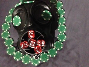
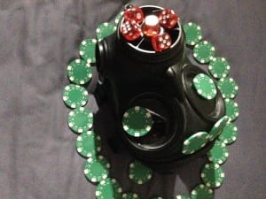
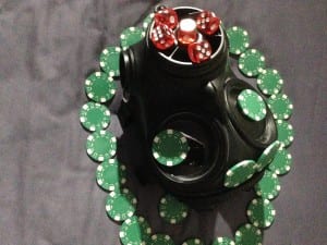
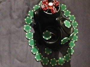
The first image (the image on the far right) of the labelled from the bottle is trying to convey the idea of stress and when people are stressed it isn’t just our faces it’s also our actions that can show our hidden emotion.
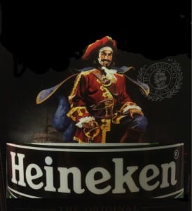
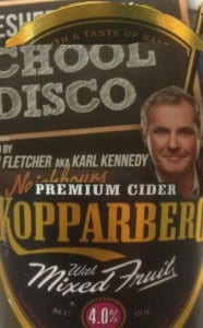
The second image part to the image is the idea is taking away a brands power can’t just let be done by removing the words of the image but the iconography of the image will always stay for instance taking away the brand name doesn’t take away its recognition to people.
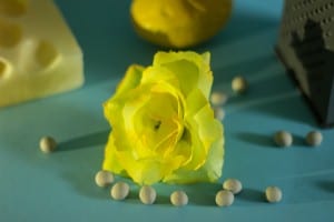
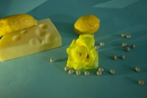
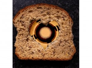
The third image (the middle image) i created simply because i wanted create this idea of there are more dimensions to an object that what see and for what is intended for the object.
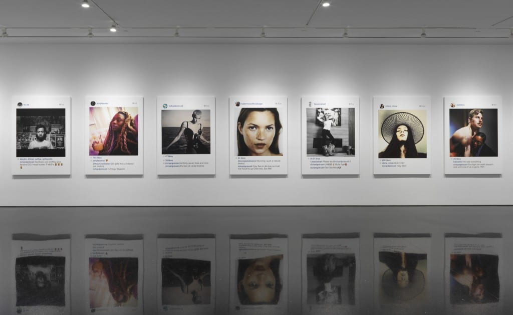
A large portion of my images where inspired by Richard prince who is famous for taking other peoples images and converting them to there own design. He has been criticised for ripping off other peoples work. This pics he deiced to frame other peoples Instagram post and use them for an art gallery .
http://www.richardprince.com/
